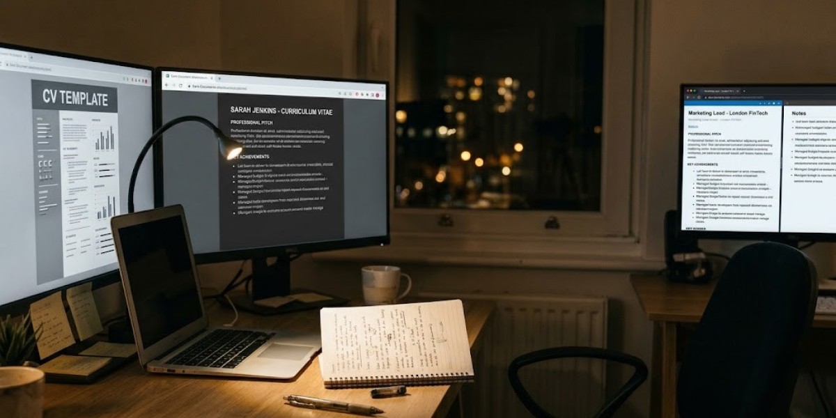
Picture this: it's 11pm, you've got three tabs open, and you're scrolling through CV templates trying to find the one with "the right vibe." A gray sidebar here. A skills bar chart there. Maybe a little headshot in the corner. It feels productive. It feels safe . You've got a finished-looking document before you've written a single sentence about yourself.
Here's the uncomfortable truth: that safety is an illusion, and it might be quietly costing you interviews.
After years of watching hiring panels tear through stacks of applications, one pattern shows up again and again. The candidates who stand out aren't the ones with the prettiest layout they're the ones whose CV reads like it was built for the job , not pulled off a shelf. And that only happens when you start from nothing.
Your CV Isn't a Diary It's a Pitch
Somewhere along the way, CVs got confused with autobiographies. People try to cram in every task, every course, every Saturday job since sixth form, as if leaving something out is a crime. It isn't. A CV has exactly one job: get you into the interview room. That's it.
When you start with a template, you end up writing to fill boxes instead of writing to persuade. The layout decides what matters, not you. And that's backwards.
Here's the number that should genuinely worry you: most UK hiring managers spend around ten seconds on their first pass of an application. Ten seconds. If your best achievement is sitting in a narrow sidebar because the template needed something there to balance the page, it's invisible. It might as well not exist. Starting from a blank page forces you to think like an editor what earns its place at the top, what gets cut, what actually proves you can do the job.
"But Won't a Plain CV Look Boring?"
This is the fear almost everyone has, and it's worth naming directly: if I don't use color and icons and a fancy border, will I look uninspired?
No. If anything, the opposite. UK hiring panels overwhelmingly favor clean typography and generous white space documents they can scan without effort. Color blocks and icon ratings don't say "creative," they say "downloaded a template," which is precisely the impression you're trying to avoid.
There's also a structural upside nobody mentions enough. If your career hasn't been a straight line a gap year, a redundancy, a total industry switch, some freelance work that doesn't fit neatly into dates a rigid chronological template puts that gap under a spotlight. Building your own structure means you decide what leads. Skills first. Achievements first. Whatever tells your story best.
The Small Details That Do the Heavy Lifting
Nobody gets excited about margins, but they matter more than people think. A few ground rules that consistently work:
- Font: Arial, Calibri, or Georgia, sized 10–12pt. Nothing decorative.
- Margins: Roughly 2cm all round dense enough to fit real content, open enough to breathe.
- Order: Reflects where you are now , not a generic formula. Five years into your career, your GCSEs shouldn't be sitting above your last job.
And a genuinely underrated tip: drafting in plain word-processing software rather than typing directly into a browser editor. While many jobseekers choose to write my cv online using quick web builders, drafting in a native processor gives you full control over line breaks and page splits, so the PDF a hiring manager opens looks exactly like the one you built not a reflowed mess.
Write Like You're Proving Something, Not Describing Something
This is where most CVs quietly fail, even good ones. There's a world of difference between describing your job and proving you were good at it.
Compare these two lines:
"Responsible for dealing with client queries."
"Handled up to 40 complex client queries daily while maintaining a 98% satisfaction rating."
The first is a job description. The second is evidence. One tells a hiring manager what was expected of you; the other tells them what you actually delivered. Every bullet point on your CV should pass this test does it describe a duty, or prove an outcome?
A few more in that spirit:
- Led a team of four engineers to deliver an infrastructure upgrade three weeks ahead of schedule.
- Improved first-contact resolution rates from 68% to 89% over six months.
- Managed a £250,000 quarterly budget, driving a 14% increase in qualified leads year-on-year.
Numbers do work that adjectives can't. "Hardworking" is a claim. "89% resolution rate" is a fact.
The Mistake That Kills Applications Before a Human Ever Sees Them
Here's the part almost nobody talks about: most CVs never even reach a person. They get filtered by applicant tracking software first, and fancy templates are exactly what trips it up. Multi-column tables, floating text boxes, background shading all of it can turn into unreadable garbage the moment it's parsed by an ATS. A single-column layout with standard, native headings isn't just cleaner. It's the difference between your CV landing on a desk and it landing in a digital black hole.
Which Structure Actually Fits You?
There's no single "correct" CV format only the one that fits your story:
- Reverse chronological - the industry default, ideal if your career has moved in a steady, linear path within one sector.
- Functional / skills-based - built around capabilities rather than dates, useful for career changers or anyone returning after a break.
- Hybrid - a short summary of skills and achievements up top, chronological history below. A strong middle ground, especially for senior or contract roles.
Conservative fields law, finance, the public sector still expect traditional chronological formats. Creative and tech roles allow more room to breathe. But across every industry, one thing never changes: clarity and evidence beat decoration, every single time.
The Real Takeaway
A blank page takes more effort than a template. There's no getting around that. But it's the only approach that produces a document built entirely around you your evidence, your priorities, your story instead of someone else's idea of what a CV should look like.
When your CV is clean, quick to scan, and backed by real numbers, you stop blending into the pile of applicants who grabbed the same free template that morning. You start looking like exactly what you are: someone who understands their own value and respects the reader's time enough not to waste it.
That's not a design choice. That's a career strategy.